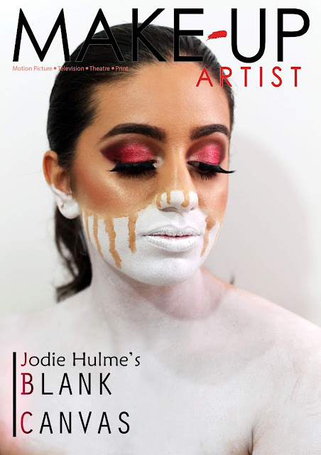
Magazine front cover - Learner response
1) Add your finished magazine cover as a JPEG image.
2) Type up your feedback from your teacher. If you've received this by email, you can copy and paste it across.
Mark: 14
Grade: A
WWW: This is simply outstanding – well done! I’m particularly impressed that you’ve criticised your own photography and make-up – it demonstrates your phenomenally high standards as I would have said they look close to professional. If you can produce your coursework at this level you will be looking at a top grade without doubt.
EBI: The only criticism I would make is actually concerning the font choice. The font you’ve used for ‘Jodie Hulme’ text lacks a little professionalism alongside the real covers of the same magazine (they use slightly sleeker, more professional sans serif fonts). It’s a very minor point but one to bear in mind for the real coursework!
3) Consider your mark against the mark scheme above. What are the strengths of your production based on the the mark scheme? Think about magazine cover conventions and the media language techniques you have used to communicate with your audience (e.g. mise-en-scene, camera shot etc.)
I have understood media language very well. The medium close up is very effective for this magazine as it allows the audience to view the makeup in close detail.
4) Look at the mark scheme again. What can you do to move your mark higher and, if required, move up a level?
To move up a level I should have used a more effective font that was better suited to the magazine.
5) What would be one piece of advice you would give a student about to start the same magazine cover project you have just completed?
Choose a magazine that you like the concept of and one that you will enjoy designing a cover for.


Comments
Post a Comment